These are my ideas which I sketched for my digipak and advertisements. As my Bands name is Plan X, I wanted to incorporate the design in to a clock, with 'X' being the roman numeral for 10. Therefore, my album cover is called 'After Dark.' I have designed this way as I think that the clock would become an important marketing symbol for my band if they were to continue. This is why the digipak, video and advertisement all include a clock. I think it is very important to remain consistent throughout the design. Therefore, I will use the same font, American Typewriter and keep my digpak black and white. The Black and white images also represent the 'after dark' theme of my digipak.

The front of the digipak must include both Andy and Molly. As previously explained, I found an image that I liked on Pinterest with a similar image of a girl sitting against a brick wall.

I like this image because of the simplicity of the design. I thought therefore I could replicate this image and add my own twist to it. I have not decided whether to have Andy and Molly's head upside down like it is in the image and think that once I have taken the photo I will have a better idea of what will look best. The location will be an old railway bridge, which now has graffiti on the inside. I want the costume to be extremely casual and low-key, therefore, jeans and coats will suit the image well. I want the image to be taken at night time to fit with the theme of after dark, therefore, I will need additional lights so that the image is not too dark. Therefore, I think I will use the high bean on my car to create extra lighting. I do not need any props to include this image- i think that simplicity is more effective.
The back of the front cover features both Andy and Molly, because I think it is important that they feature in a lot of their marketing and advertising on the CD, as the fans have bought the CD to see and relate to the Band. The image features Molly and Andy standing against a different wall covered in pink graffiti reading 'freedom'. They are both directly staring in to the camera, remaining eye-contact. In editing, I will place the photo of a lighter (that I took earlier) and change the transparency of it so that the image lays on top. The image will be black and white. The name of the editors, producers etc will be listed in the centre at the bottom of the page (in this case, me!)
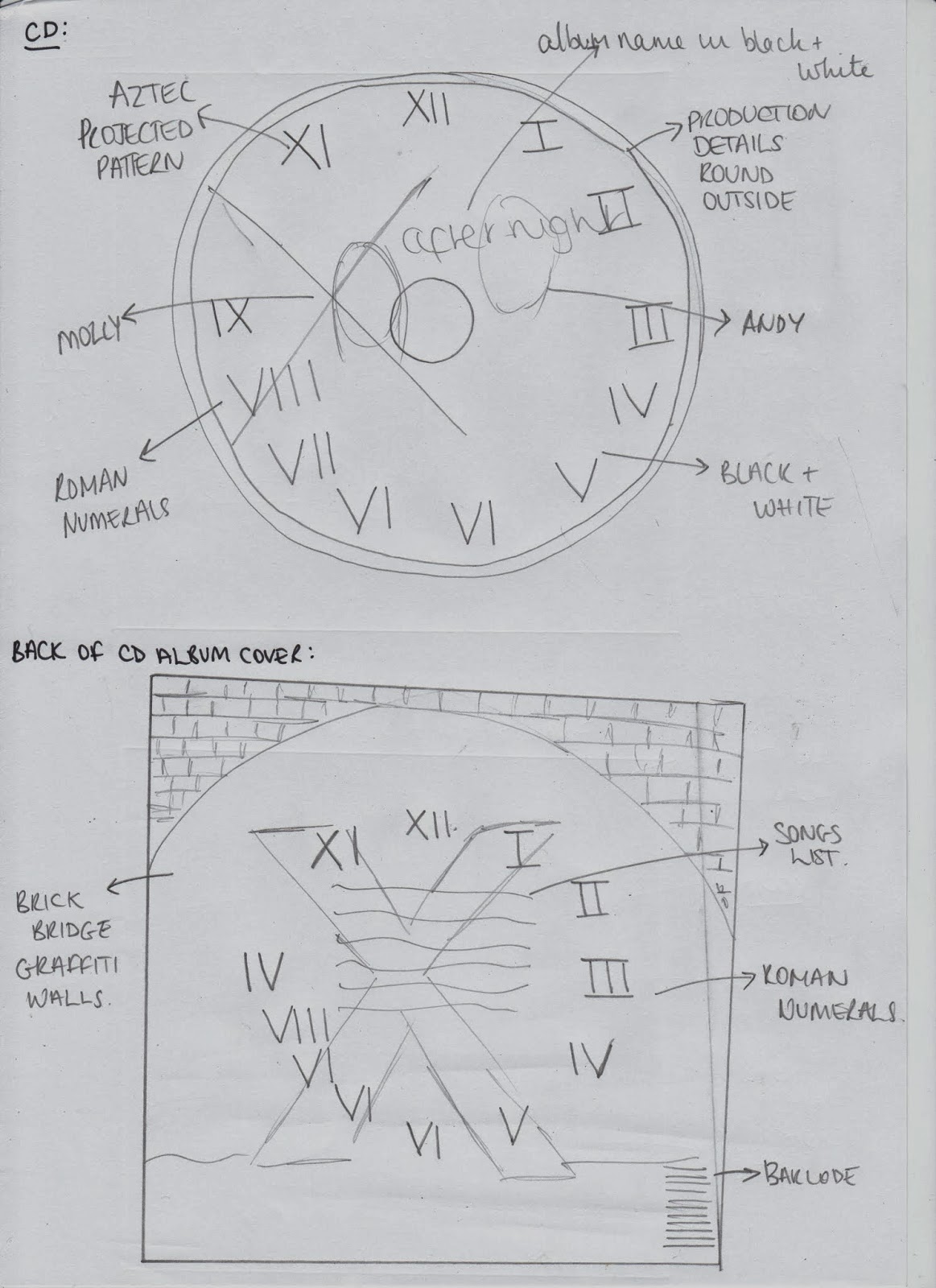
CD --> The CD once again features Molly and Andy. This time, a projector of an aztec design will be projected on to their faces. I will then turn the image black and white. After looking at current existing CD's, many of them have an "All Rights Reserved" notice on them. I think that this is very important as copyright and piracy is a major problem within the music industry, equating to the current economic loss of 1.222 billion. therefore, this will be included around the edge of the CD. The Roman numerals of the clock will be represented around the outside and the large 'X', representing the name of the band and 10 o'clock, which refers to the album name 'after dark' The 'X' will be quite large and I will edit it making it slightly transparent.

This is my plan for the advertisement. The location on the site will be in a junk yard. There will be old pieces of machinery and building materials. The image will be black and white, and will feature both Andy and Molly. At the top of the page, the clock with roman numerals will be featured with the large 'X' Underneath, the various information will be posted about the new album that is coming out. It will also include the website s well as the blackberry scan barcode and twitter and Facebook logos, to let readers know how else they can connect. I think that it also makes the advertisement more user-frienly.
No comments:
Post a Comment